Few colors manage to feel both timeless and modern at the same time. The lavender colour is one of those rare shades that effortlessly balances elegance, softness, and personality. Whether you’re decorating a home, planning a wedding, choosing an outfit, or designing a brand identity, lavender offers remarkable versatility.
For years, this delicate hue has been associated with calmness, creativity, and sophistication. Yet today’s designers are using it in bold and unexpected ways. From minimalist interiors to fashion runways and digital branding, lavender continues to evolve while maintaining its gentle charm.
In this complete guide, you’ll discover the most popular shades of lavender, the best color combinations, practical styling tips, and creative ways to incorporate this beautiful tone into everyday life.
What Is Lavender Colour?
The lavender colour is a soft, pale shade of purple inspired by the blossoms of the lavender plant. It sits between violet and pastel purple on the color spectrum and often contains subtle blue, pink, or gray undertones.
Unlike deep royal purple, lavender feels lighter, fresher, and more approachable. It combines the creativity and luxury of purple with the tranquility of blue, creating a balanced and soothing appearance.
Key Characteristics of Lavender Colour
- Soft and calming
- Elegant and sophisticated
- Feminine without being overwhelming
- Versatile across different design styles
- Works well in both modern and traditional settings
The Psychology Behind Lavender Colour
Colors influence emotions more than many people realize. The lavender colour carries unique psychological associations that make it popular across various industries.
Emotional Associations
- Relaxation and peace
- Creativity and imagination
- Spirituality and mindfulness
- Luxury and refinement
- Romance and tenderness
Because of these qualities, lavender is commonly used in:
- Spa interiors
- Wellness brands
- Beauty products
- Wedding themes
- Bedroom decor
- Meditation spaces
Many people find that lavender creates a comforting atmosphere without feeling dull or overly neutral.
Popular Shades of Lavender Colour
Not all lavender tones look the same. Different undertones can dramatically change the mood and application of the color.
1. Classic Lavender
The traditional lavender colour most people recognize.
Characteristics:
- Soft purple hue
- Balanced blue and pink undertones
- Gentle and elegant appearance
Best for:
- Bedrooms
- Wedding decor
- Fashion accessories
2. Pale Lavender
A lighter variation with a dreamy aesthetic.
Characteristics:
- Very soft pastel purple
- Airy and delicate feel
- Bright and fresh
Best for:
- Nurseries
- Spring-themed decor
- Minimalist interiors
3. Lavender Gray
A muted blend of lavender and gray.
Characteristics:
- Sophisticated
- Modern
- Neutral-friendly
Best for:
- Contemporary homes
- Office spaces
- Professional branding
4. French Lavender
A richer and slightly deeper version.
Characteristics:
- More vibrant
- Stronger purple presence
- Luxurious appearance
Best for:
- Statement walls
- Evening wear
- Premium packaging
5. Dusty Lavender
A vintage-inspired tone.
Characteristics:
- Muted purple
- Slight gray undertones
- Romantic appeal
Best for:
- Rustic weddings
- Vintage interiors
- Floral arrangements
Best Lavender Colour Combinations
One reason the lavender colour remains so popular is its compatibility with numerous shades. Here are some of the most attractive pairings.
Lavender and White
This timeless combination feels fresh, clean, and sophisticated.
Benefits:
- Brightens spaces
- Creates visual balance
- Works in every season
Perfect for:
- Bedrooms
- Bathrooms
- Bridal themes
Lavender and Gray
A favorite among interior designers.
Benefits:
- Modern elegance
- Calm atmosphere
- Professional appearance
Perfect for:
- Living rooms
- Offices
- Contemporary branding
Lavender and Gold
This pairing instantly adds luxury.
Benefits:
- Rich contrast
- Upscale aesthetic
- Glamorous finish
Perfect for:
- Event decor
- Packaging design
- Accent furniture
Lavender and Sage Green
Inspired by nature, this combination feels organic and refreshing.
Benefits:
- Harmonious appearance
- Relaxing vibe
- Balanced color palette
Perfect for:
- Garden weddings
- Farmhouse decor
- Botanical branding
Lavender and Navy Blue
A bold yet sophisticated pairing.
Benefits:
- Strong contrast
- Professional feel
- Modern elegance
Perfect for:
- Fashion styling
- Corporate branding
- Accent walls
Lavender and Blush Pink
Soft, romantic, and highly popular.
Benefits:
- Feminine elegance
- Warmth and charm
- Dreamy atmosphere
Perfect for:
- Weddings
- Beauty brands
- Bedroom decor
Lavender Colour Combination Table
| Lavender Pairing | Style Effect | Best Use |
|---|---|---|
| Lavender + White | Clean and fresh | Bedrooms, weddings |
| Lavender + Gray | Modern and elegant | Offices, living rooms |
| Lavender + Gold | Luxurious and glamorous | Events, branding |
| Lavender + Sage Green | Natural and calming | Gardens, interiors |
| Lavender + Navy | Sophisticated contrast | Fashion, branding |
| Lavender + Blush Pink | Romantic and soft | Weddings, decor |
| Lavender + Silver | Contemporary elegance | Modern interiors |
| Lavender + Beige | Warm and balanced | Home styling |
| Lavender + Charcoal | Bold sophistication | Accent spaces |
| Lavender + Mint Green | Playful freshness | Spring themes |
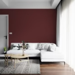
Using Lavender Colour in Interior Design
Interior designers often choose the lavender colour because it creates a relaxing atmosphere while adding visual interest.
Living Room Ideas
Lavender can work as either a primary color or an accent.
Popular applications:
- Throw pillows
- Area rugs
- Accent chairs
- Wall art
- Curtains
Pairing lavender with neutral tones such as ivory, taupe, cream, and gray creates a balanced space.
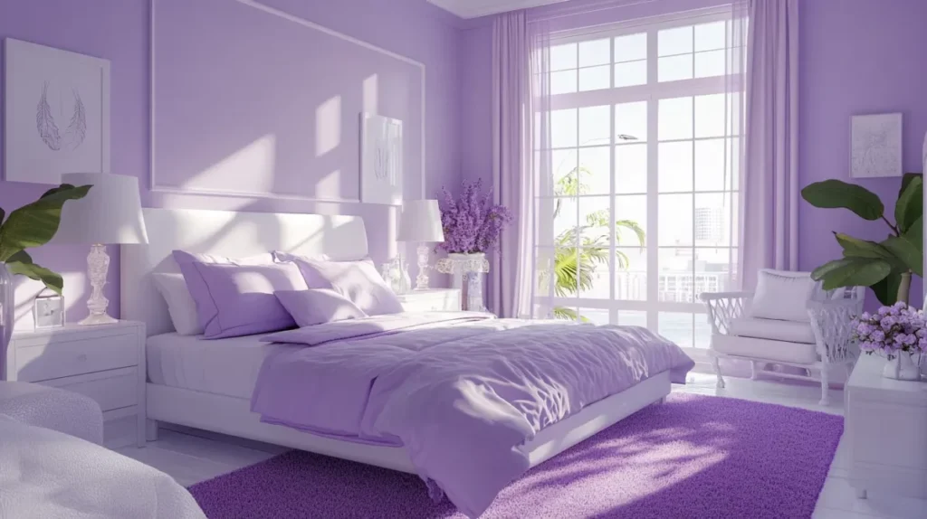
Bedroom Styling
The bedroom is perhaps the most natural place for the lavender colour.
Ideas include:
- Lavender bedding
- Soft purple walls
- Upholstered headboards
- Decorative cushions
- Floral artwork
The calming effect of lavender helps create a peaceful environment ideal for rest.
Kitchen Accents
Lavender isn’t limited to bedrooms.
Try:
- Cabinet accessories
- Ceramic dishes
- Backsplash details
- Fresh lavender arrangements
- Decorative jars
These small touches can add personality without overwhelming the space.
Lavender Colour in Fashion
Fashion designers frequently use the lavender colour because it flatters a wide range of skin tones and offers a refreshing alternative to traditional neutrals.
Why Lavender Is Trending
Lavender feels:
- Modern
- Elegant
- Youthful
- Luxurious
- Seasonally versatile
Clothing Ideas
Popular lavender fashion pieces include:
- Dresses
- Blazers
- Sweaters
- Handbags
- Shoes
- Scarves
Best Colors to Wear With Lavender
- White
- Cream
- Beige
- Navy
- Black
- Silver
- Gray
- Soft pink
These combinations help create stylish and balanced outfits.
Lavender Colour in Weddings
Wedding planners love the lavender colour because it feels romantic without becoming overly traditional.
Popular Lavender Wedding Elements
Flowers
- Lavender stems
- Roses
- Hydrangeas
- Lilacs
- Orchids
Decorations
- Table runners
- Chair sashes
- Candle arrangements
- Invitation designs
Bridal Party Styling
Lavender bridesmaid dresses continue to be a popular choice because they photograph beautifully in natural light.
Lavender Colour in Branding and Marketing
Brands increasingly use lavender to stand out in crowded markets.
What Lavender Communicates
- Creativity
- Innovation
- Calmness
- Premium quality
- Wellness
Industries that frequently use lavender include:
- Beauty
- Skincare
- Wellness
- Lifestyle
- Technology
- Luxury goods
A thoughtfully designed lavender palette can help brands appear approachable while maintaining sophistication.
Seasonal Uses of Lavender Colour
Spring
Lavender naturally shines during spring.
Pair it with:
- Mint green
- White
- Soft yellow
- Peach
Summer
For summer, combine lavender with:
- Sky blue
- Coral
- Turquoise
- Crisp white
Autumn
Unexpectedly, lavender works beautifully in fall.
Try pairing it with:
- Rust
- Terracotta
- Mustard
- Olive green
Winter
Winter combinations include:
- Silver
- Charcoal gray
- Navy
- Deep plum
Common Mistakes When Using Lavender Colour
Even a beautiful shade can lose its impact when used incorrectly.
Using Too Many Pastels
Pairing lavender with several pale colors can make a space feel washed out.
Instead:
- Add contrast
- Include darker accents
- Use texture
Ignoring Undertones
Some lavender shades lean blue, while others lean pink.
Always compare samples before committing to:
- Paint colors
- Fabrics
- Fashion pieces
Overusing the Shade
While the lavender colour is versatile, excessive use may reduce visual interest.
Balance it with:
- Neutrals
- Metallic accents
- Natural wood tones
How to Choose the Right Lavender Shade
When selecting a lavender tone, consider:
Lighting
Natural light often enhances lavender’s blue undertones.
Artificial light may make it appear warmer or more purple.
Room Size
Lighter lavender shades can make small spaces feel larger and brighter.
Existing Decor
Consider nearby colors, textures, and materials before choosing a shade.
Purpose
Different shades create different moods:
- Pale lavender: calm and airy
- French lavender: luxurious and bold
- Lavender gray: sophisticated and modern
- Dusty lavender: romantic and vintage
Why Lavender Colour Remains Timeless
Trends come and go, yet the lavender colour consistently finds its way back into homes, fashion collections, and design projects.
Its lasting popularity comes from its unique balance of qualities:
- Soft but noticeable
- Elegant but approachable
- Creative but calming
- Modern yet timeless
Few colors offer such versatility across so many different applications.
Whether you’re designing a living room, planning a wedding, updating your wardrobe, or creating a brand identity, lavender provides endless possibilities.
Conclusion
The lavender colour is far more than just a pastel purple shade. It represents elegance, creativity, relaxation, and versatility all at once. From pale lavender and dusty lavender to richer French lavender tones, there is a variation suitable for virtually every design style and personal preference.
When paired thoughtfully with white, gray, gold, navy, sage green, blush pink, or silver, lavender can transform spaces, outfits, and visual identities into something truly memorable. Its ability to work across seasons, industries, and aesthetics makes it one of the most adaptable colors available today.