Why the Teal Color Feels So Captivating
There’s something oddly calming yet powerful about the teal color. It sits quietly between blue and green, but somehow manages to feel more expressive than either. You might not always notice it at first glance, but once it appears in a room, outfit, or design, it tends to stay in your mind longer than expected.
The teal color has become a favorite in modern design, fashion trends, and digital branding because it balances freshness with sophistication. It feels coastal yet corporate, natural yet refined. That dual personality is exactly why designers keep returning to it again and again.
In this guide, we’ll explore everything about the teal color—from its meaning and psychology to its shades, variations, and real-world uses.
What is Teal Color?
The teal color is a deep blue-green hue that takes its name from the common teal bird, which has a similar colored stripe on its head. It is often described as a blend of ocean blue and forest green, creating a tone that feels both cool and grounded.
Unlike brighter cyan or aqua tones, teal color carries more depth and maturity. It works beautifully in both soft and bold applications depending on how it’s paired.
Common associations of teal color include:
- Balance and emotional stability
- Calmness and relaxation
- Creativity and clarity
- Modern elegance
- Natural harmony
Because of these traits, the teal color is widely used in interior design, branding identity, web design, and even psychology-driven marketing.
The Psychology Behind Teal Color
Color psychology plays a huge role in how we perceive the teal color. It sits at the intersection of two emotionally strong colors—blue and green.
Blue typically represents trust and calmness, while green symbolizes growth and renewal. When combined, the teal color creates a psychological blend of both stability and freshness.
Emotional Effects of Teal Color
- Encourages mental clarity and focus
- Reduces stress and anxiety
- Promotes balance between logic and emotion
- Inspires creativity without overwhelming the senses
Many wellness brands and tech companies use teal color in their visual identity because it feels trustworthy yet innovative.
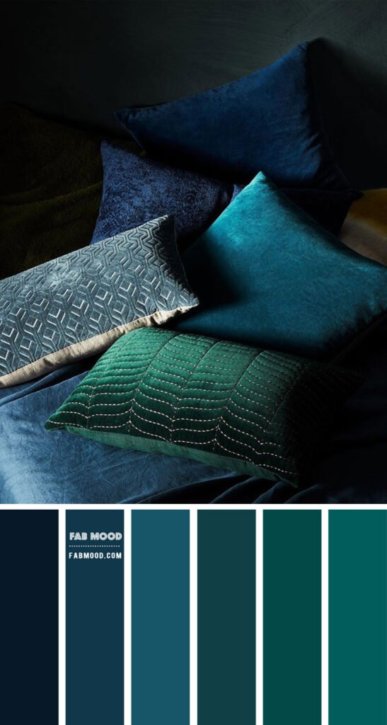
Popular Shades of Teal Color
The teal color is not just one fixed tone. It has multiple variations that change depending on brightness, saturation, and depth.
1. Light Teal Color
This version is softer and airier. It feels almost pastel-like and is commonly used in minimalist design and baby-themed palettes.
2. Dark Teal Color
A richer, deeper tone that leans heavily toward navy. It is often used in luxury branding and formal interior settings.
3. Bright Teal Color
More vibrant and energetic, this shade of teal color works well in digital graphics and youthful branding.
4. Muted Teal Color
This version is toned down with gray undertones, giving it a vintage or rustic appearance.
5. Aqua Teal Color
A lighter, more aquatic variation that leans toward tropical and beach-inspired themes.
Each variation of teal color serves a different emotional and visual purpose depending on context.
Teal Color in Interior Design
One of the most popular uses of teal color is in home interiors. It adds depth without being overwhelming, making it perfect for both modern and traditional spaces.
Living Rooms
Teal color walls or furniture can instantly elevate a living room. It pairs beautifully with neutral tones like beige, white, and grey.
Bedrooms
Soft teal color shades create a calming atmosphere ideal for relaxation and sleep.
Kitchens
In kitchens, teal color cabinets or tiles add a fresh and stylish twist without overpowering the space.
Bathroom Spaces
The aquatic nature of teal color makes it a natural fit for bathrooms, especially when combined with white ceramics and metallic accents.
Designers often mix teal color with:
- Gold accents
- Wooden textures
- Marble surfaces
- Matte black finishes
This combination creates a balanced, premium aesthetic.
Teal Color in Fashion Trends
The fashion world has embraced teal color for its versatility. It suits both casual wear and formal outfits.
Why Fashion Loves Teal Color
- Flatters most skin tones
- Works in all seasons
- Feels elegant yet approachable
- Easy to match with neutral shades
Common Fashion Uses
- Teal color dresses for evening wear
- Blazers and suits for professional outfits
- Accessories like scarves, bags, and shoes
- Sportswear and athleisure collections
When styled correctly, teal color can act as a statement piece without being too loud.
Teal Color in Branding and Marketing
Modern branding relies heavily on color psychology, and teal color has become a popular choice among startups and established companies alike.
Why Brands Choose Teal Color
- Communicates trust and reliability
- Feels modern and tech-friendly
- Stands out without being harsh
- Appeals to both men and women
Industries that frequently use teal color include:
- Technology companies
- Healthcare brands
- Financial services
- Wellness and spa businesses
- Creative agencies
A well-designed logo using teal color can instantly communicate professionalism and innovation.
Teal Color in Web and UI Design
In digital design, teal color is widely used for its readability and aesthetic balance.
UI Advantages of Teal Color
- Improves user focus on call-to-action buttons
- Creates visual hierarchy in layouts
- Works well on both light and dark themes
- Enhances accessibility when paired correctly
Web designers often combine teal color with white space, soft gradients, and minimalistic typography to create clean user experiences.
Teal Color Combinations That Work Best
Pairing teal color correctly can completely change the mood of a design.
Best Color Pairings
- Teal color + white = clean and modern
- Teal color + gold = luxury and elegance
- Teal color + coral = energetic and playful
- Teal color + grey = professional and balanced
- Teal color + beige = warm and natural
Each combination gives teal color a different personality, making it incredibly flexible.
Cultural and Symbolic Meaning of Teal Color
Across different cultures, teal color holds varied meanings. While interpretations differ, it is generally seen as a calming and stabilizing color.
In modern symbolism, teal color often represents:
- Emotional healing
- Communication clarity
- Inner peace
- Fresh beginnings
- Balanced energy
Because of this symbolic richness, teal color is often used in wellness spaces and meditation environments.
Advantages of Using Teal Color in Design
Here are some key benefits of incorporating teal color into creative work:
- Enhances visual appeal without overpowering
- Works across digital and print media
- Appeals to wide audience demographics
- Supports brand memorability
- Creates emotional connection with viewers
Whether it is used subtly or boldly, teal color always brings a refined touch.
Common Mistakes When Using Teal Color
Even though teal color is versatile, it can be misused.
Avoid These Mistakes
- Overusing teal color in one space
- Pairing it with overly saturated competing tones
- Ignoring lighting conditions in interiors
- Using incorrect shade balance in branding
Proper balance ensures that teal color remains elegant rather than overwhelming.
Conclusion: Why Teal Color Continues to Stay Timeless
The teal color is more than just a visual shade—it’s a feeling, a mood, and a design language that continues to evolve. Whether used in interiors, fashion, branding, or digital design, it always brings a sense of balance that few colors can match.
What makes the teal color truly special is its ability to adapt. It can feel bold in one setting and soothing in another. It can represent luxury, nature, technology, or simplicity depending on how it is used.
As design trends continue to shift, one thing remains constant: the teal color will always find its place. If you haven’t experimented with it yet, now might be the perfect time to explore its possibilities and see how it transforms your creative space.
If you’ve used teal color in your own projects or designs, sharing your experience can inspire others to see this unique shade in a new light.